As you invest your money in the stock market you’ll come across the term “compound interest” quite frequently.
This post is somewhat different from what I have traditionally done, but I felt like talking about compound interest was important. I won’t go into massive detail about it directly, instead I want to focus on numbers and visuals.
To help you fully understand compound interest and how it works to your advantage, I made some tables and graphs in Google Sheets.
Now, I’m no math wizard, data scientist or spreadsheet master, but I felt this post needed this.
That said, here’s what is covered:
What is Compound Interest ?
As I mentioned in the intro, there are a lot of articles about compound interest and how it works. So I do not plan on spending much time here explaining it.
However, a simple definition and context I think would be great.
Compound interest is simply the interest on the principal amount, plus whatever interest has already accrued.
And this is what the math formula looks like (I really dislike math):

Say what? The definition is not exactly clear and why are there letters in this math equation!?
All kidding aside, this is why breaking it down into simple numbers is easier. So here is the math with small numbers.
You invest $100 into an account that accrues 1% interest each year. After the first year you now have $101 ($100*.01 = $1, $1 + $100 = $101).
Now, if you did not contribute anything else in the second year, you would then add your 1% interest on your $101. So after year two, you now have $102.01.
A common theme with new investors or those just trying to save for retirement is:
“How will I ever get to six-figures or more to be able to retire?”
The answer is compound interest.
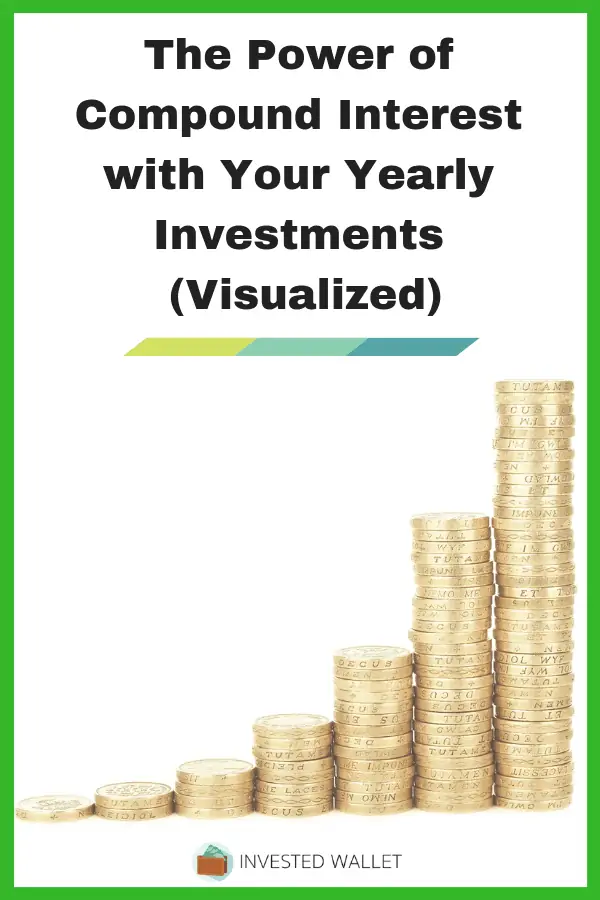
Compound Interest Examples Visualized
The definition and math equation can be a bit intimidating at first, but I think the basic number breakdown example clears it up.
But, I still
For all the below scenarios, this assumes the following:
- The average stock market returns vary from 7-10%, I choose to be more conservative at 7%.
- These do not account for inflation over the years or the ups and downs of stock investing.
- This also is not accounting any fees from your investments or withdrawals.
These compound interest examples are purely to get a rough estimate of some compound interest numbers visualized.
I also found this formula and set up through an old Reddit thread, then changed it up to fit my style and what I wanted to show.
Investing Exactly $100 Each Year
If every year you invested just $100 and got an average 7% return, in 20 years you would have $4,387. By 40 years you’d have over $21,000.


Investing Exactly $1,000 Each Year
If every year you invested $1,000 and got an average 7% return, in 20 years you would have $43,865. By 40 years you’d have over $213,000!


Investing Exactly $10,000 Each Year
If every year you invested $10,000 and got an average 7% return, in 20 years you would have $438,652. By 40 years you’d have over $2,100,000!
Note: If you increased your contribution each year by 1%, in 20 years you’d have $472,493 (a $33,841 difference). By 40 years you’d have $2,404,931 (a $304,931 difference)!


Maxing Out Your IRA
The current max contribution is $6,000, with this number generally increasing to account for inflation. These max contributions do increase from time to time as it was previously $5,500.
However, to keep it simple, we’ll only assume you are adding $6,000 each year. If every year you invested $6,000 and got a 7% return, in 20 years you would have $263,191. By 40 years you’d have over $1,280,000!


Maxing Out Your Company 401k
If you are lucky enough to have a company 401k and can max it out each year, you’ll be sitting pretty good. This data does not account for inflation, company matches, etc.
Assuming you contribute $19,000 (latest contribution number as of this publication) and got an average 7% return, in 20 years you would have $833,438. By 40 years, you would have over $4,000,000!


Final Thoughts
As you can see from the data and basic charts, the more money you save, the stronger your compound interest goes to work for you.
Even if you only invest the max in an IRA, look at what you can have in 20+
Again, the above data does not count for inflation, withdrawal fees, and any investment fees, but this should make you think and see the bigger picture (hopefully).
Now, of course, not everyone can afford to put away as much as $10,000/year, or you may have some off years for saving, or maybe you do contribute the max to a 401k.
No matter what, doing something is better than nothing.
You can start small at $100 or $1,000 per year and gradually increase your contribution by X% each year and compound interest can really take off.
Does this data help visualize how compound interest can help you? When did you start investing for retirement? Let me know in the comments below.